Denamarin Brand Refresh
Client
Nutramax Laboratories, Veterinary Sciences
Year
2021
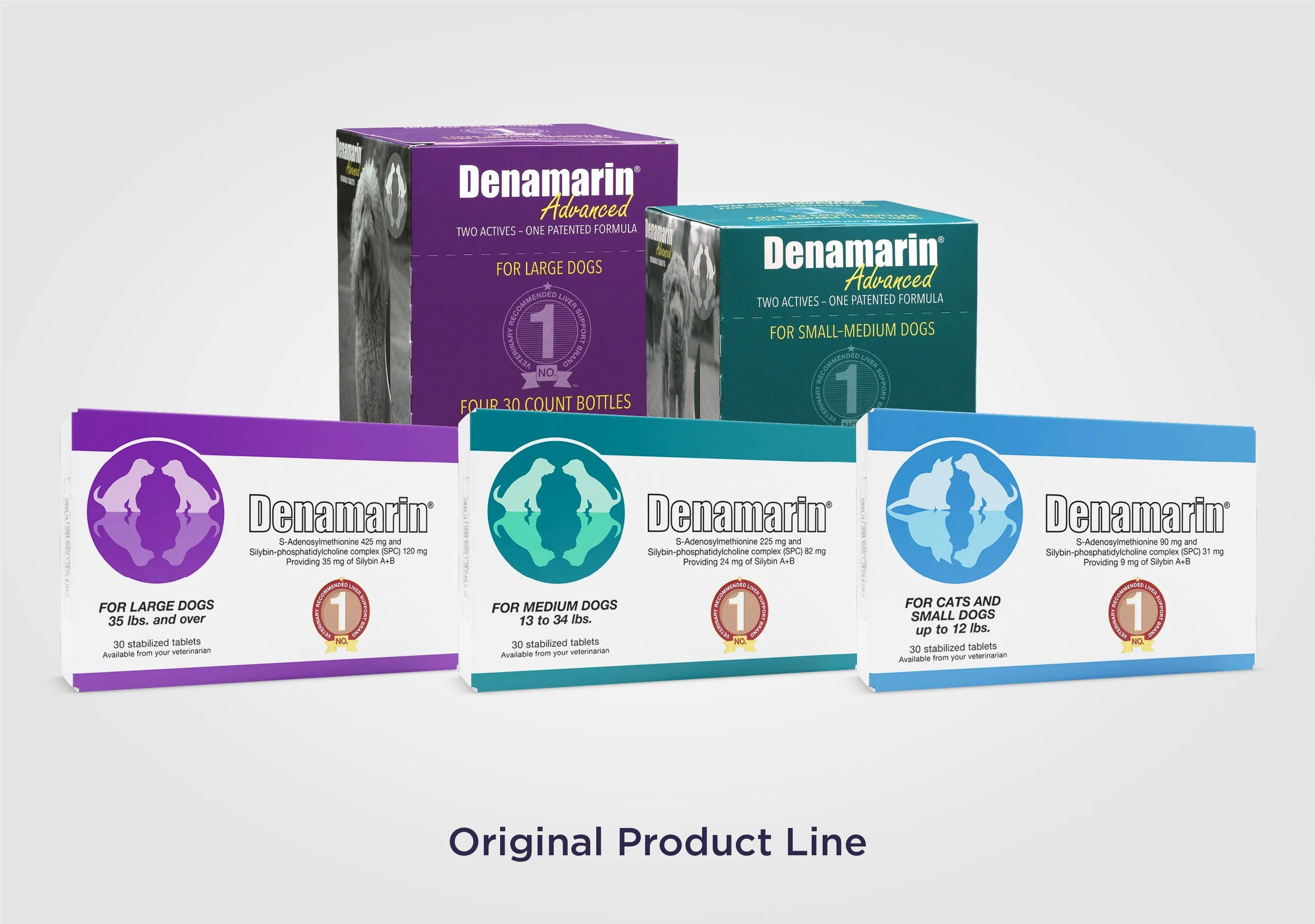
The Denamarin product line of pet liver support supplements had expanded and entered new distribution channels, but the brand visuals were not keeping up. This brand refresh needed to create stronger product hierarchy, mass market appeal, and a key unifying element without straying away from the previously established brand.
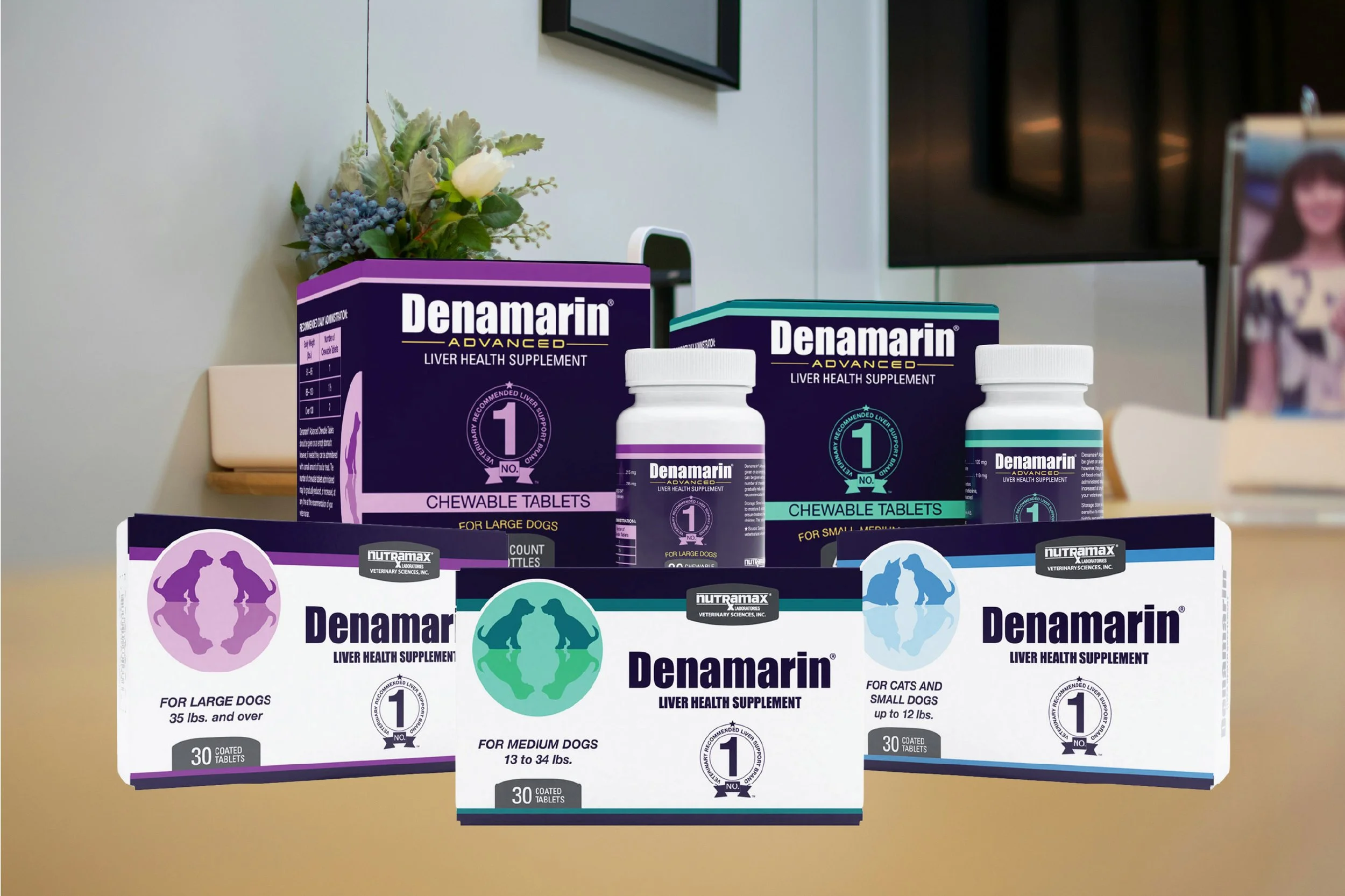
The visual updates are reflected in the full packaging line, modernizing the product and creating hierarchy between the regular and advanced product lines.
HISTORY OF THE DENAMARIN BRAND
The Denamarin brand was established decades ago and had a B2B distribution model: Nutramax Laboratories sales reps sold Denamarin directly to veterinary offices. Vets would recommend the product to customers, so the product was chosen based entirely on recommendation rather than shelf appeal. Brand visuals were not a priority when the brand was first developed.
Then, Nutramax introduced an “Advanced” product line. This line was intended to be sold exclusively through veterinary offices, opening the base product line to mass direct to consumer e-commerce distribution.
A NEW COLOR SYSTEM
A revised color system was the first step in refreshing the Denamarin brand. The magenta, teal, and light blue colors that designated pet weight needed to stay as an element that was already recognized and used to quickly identify the correct product. A deep purple was introduced to be used across the brand, working across the full palette.
The Advanced product line was differenctiated through the use of yellow and deeper, richer color saturation.


Deep purple is used to unite all elements of the Denamarin brand.
Yellow signifies the Advanced product line.


Magenta signifies the large dog SKUs.
Teal signifies the medium dog SKUs.

Light blue signifies the small dog and cat SKUs.
Modernization
Other updates to the brand were made to modernize the brand and appeal to a broader consumer audience.
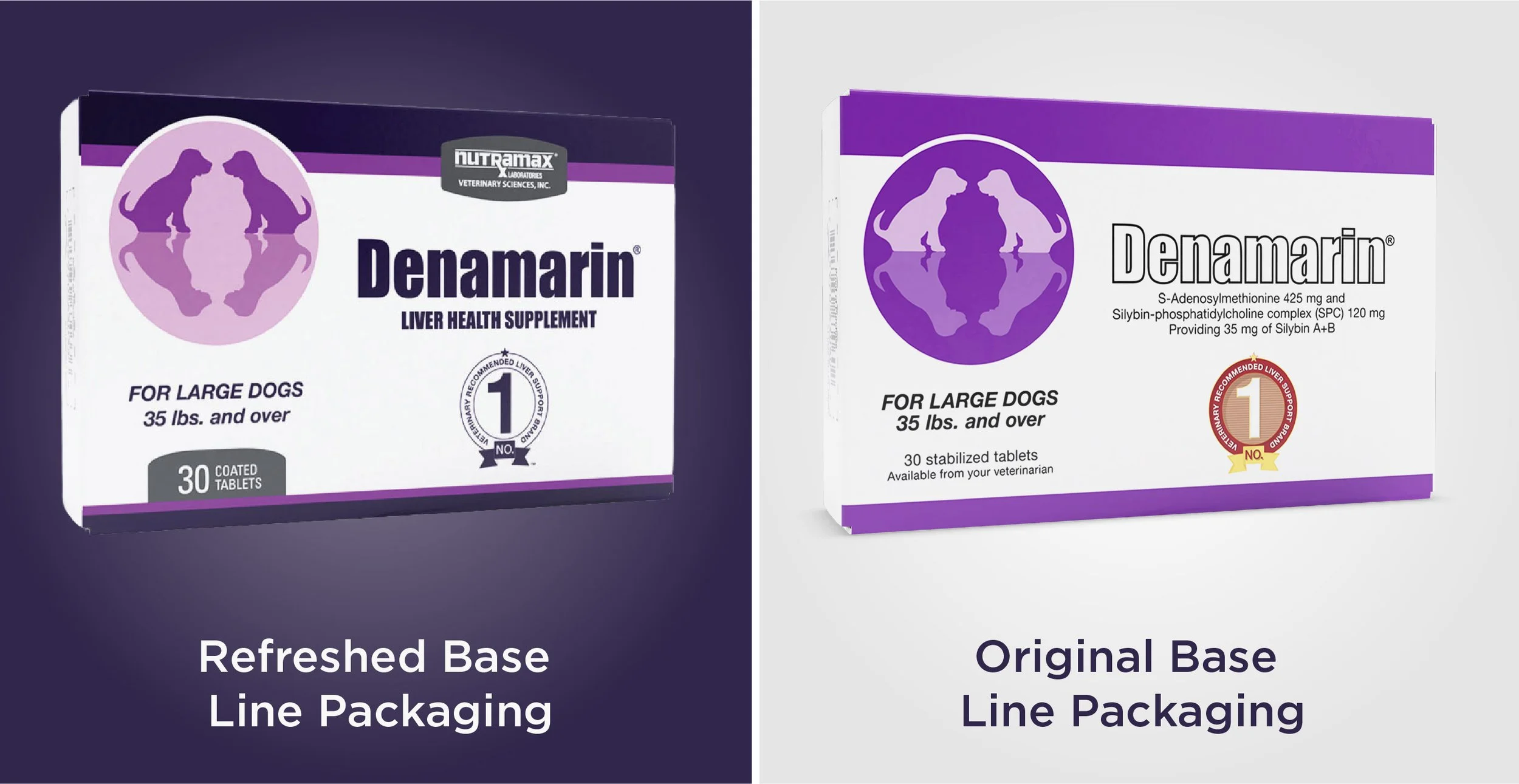
The hierarchy of information was updated to appeal to the consumer more directly: scientific ingredient names were removed and more emphasis shifted to the product count and modality.
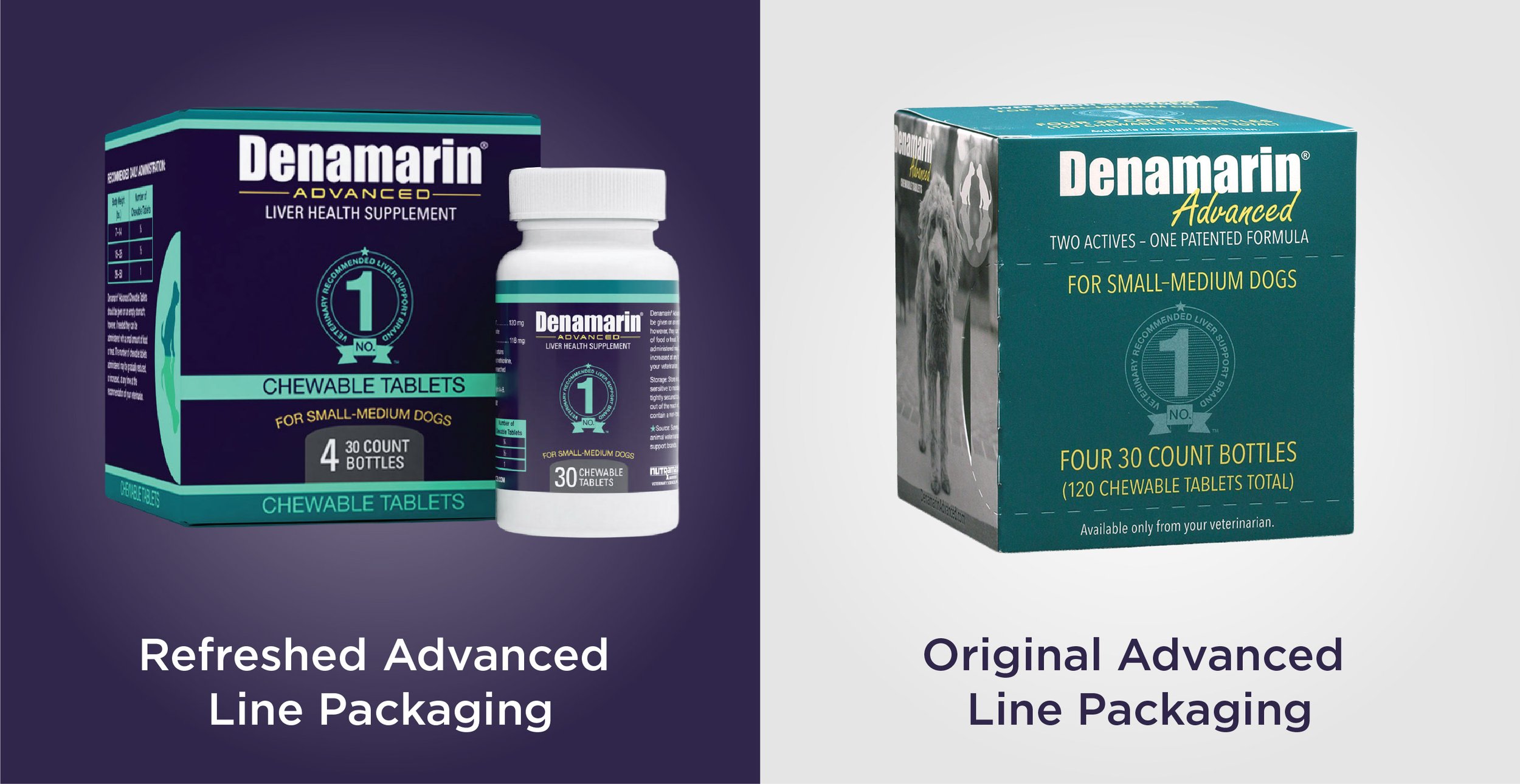
The Denamarin Advanced logo was updated to strike a more scientific tone and increase trust in the highly researched product formula.
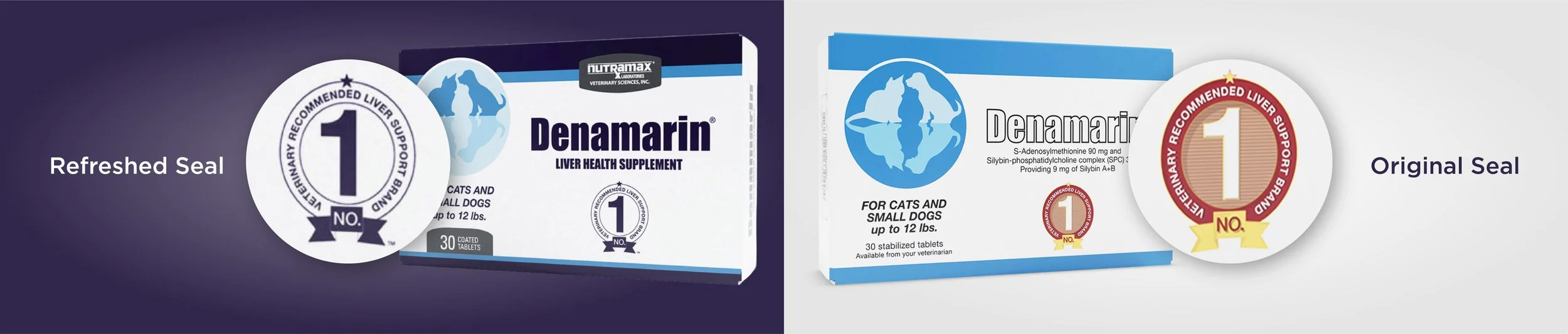
The #1 Vet Recommended badge was simplified for a more modern look. The reduction of detail also helped to increase legibility and ensure clear and consistent printing.