Queens University Roadshow
Client
Queens University of Charlotte, Office of Admissions
Year
2025
The Queens University Admissions team needed a table display and promotional materials that would visually stand out from hundreds of competitors to attract high school students to the school.
Queens admissions counselors travel to college fairs across the country to introduce Queens to thousands of prospective students. Surrounded by other universities’ table displays, it is key that the Queens table stand out and draw in its audience of Generation Z high school students.
This is often the first encounter a prospect has with the Queens University brand, so it sets the tone for future touchpoints within the customer experience. The bold and tenacious brand tone and key visual elements must be clear to encourage brand recognition in future encounters. Key value propositions and points of differentiation must also take center stage to help Queens stand out in a competitive market.
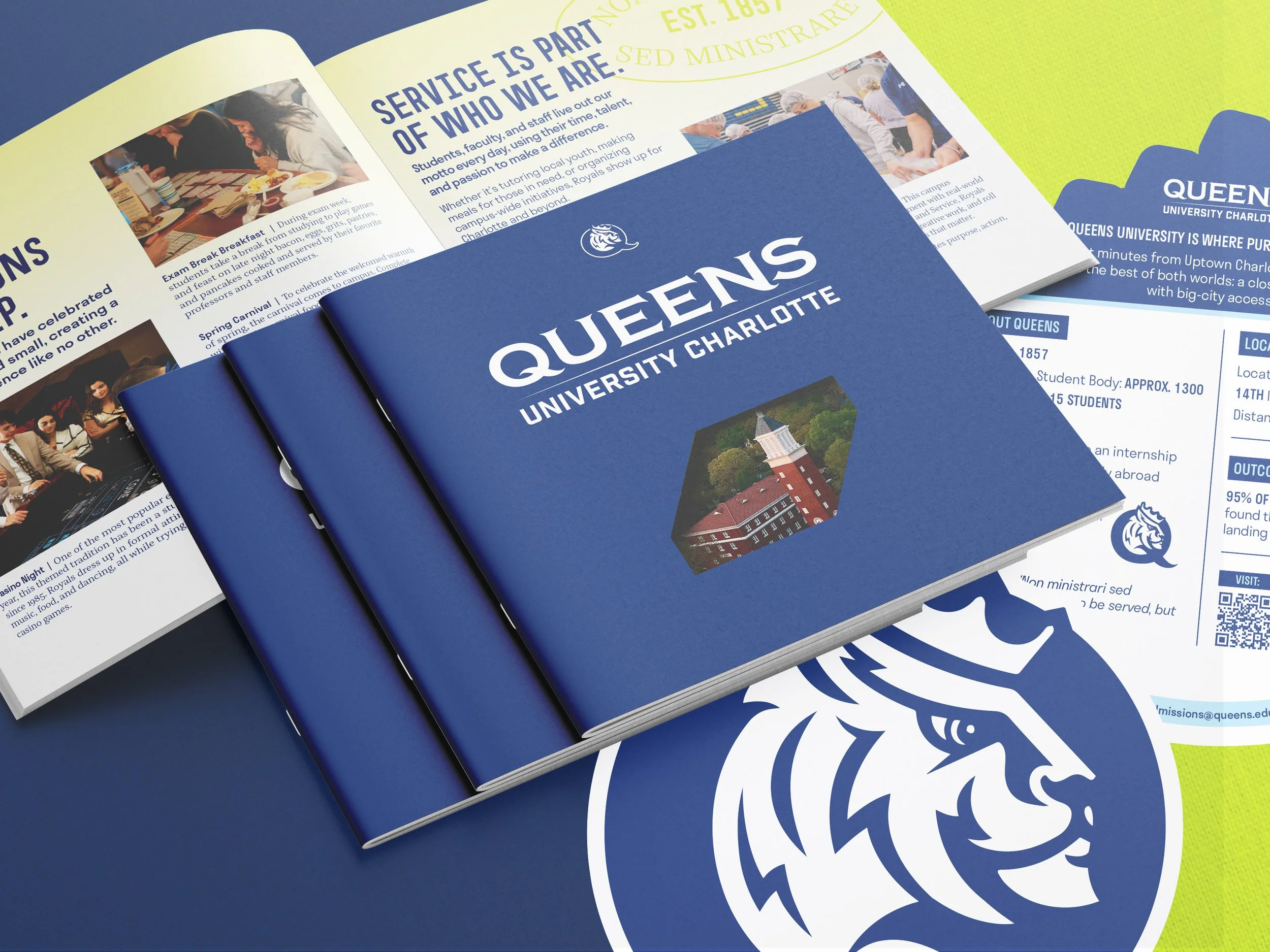
Viewbook
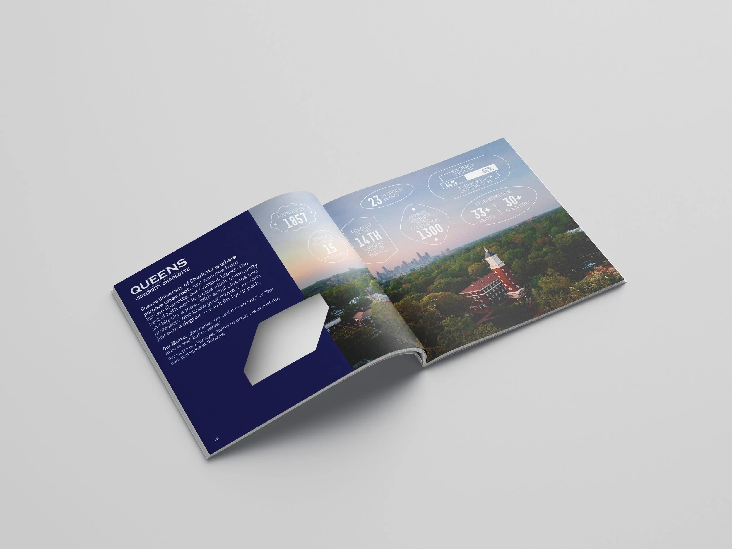
The viewbook is the primary piece of admissions marketing collateral. It acts as an overview of what prospects can expect from the Queens experience.
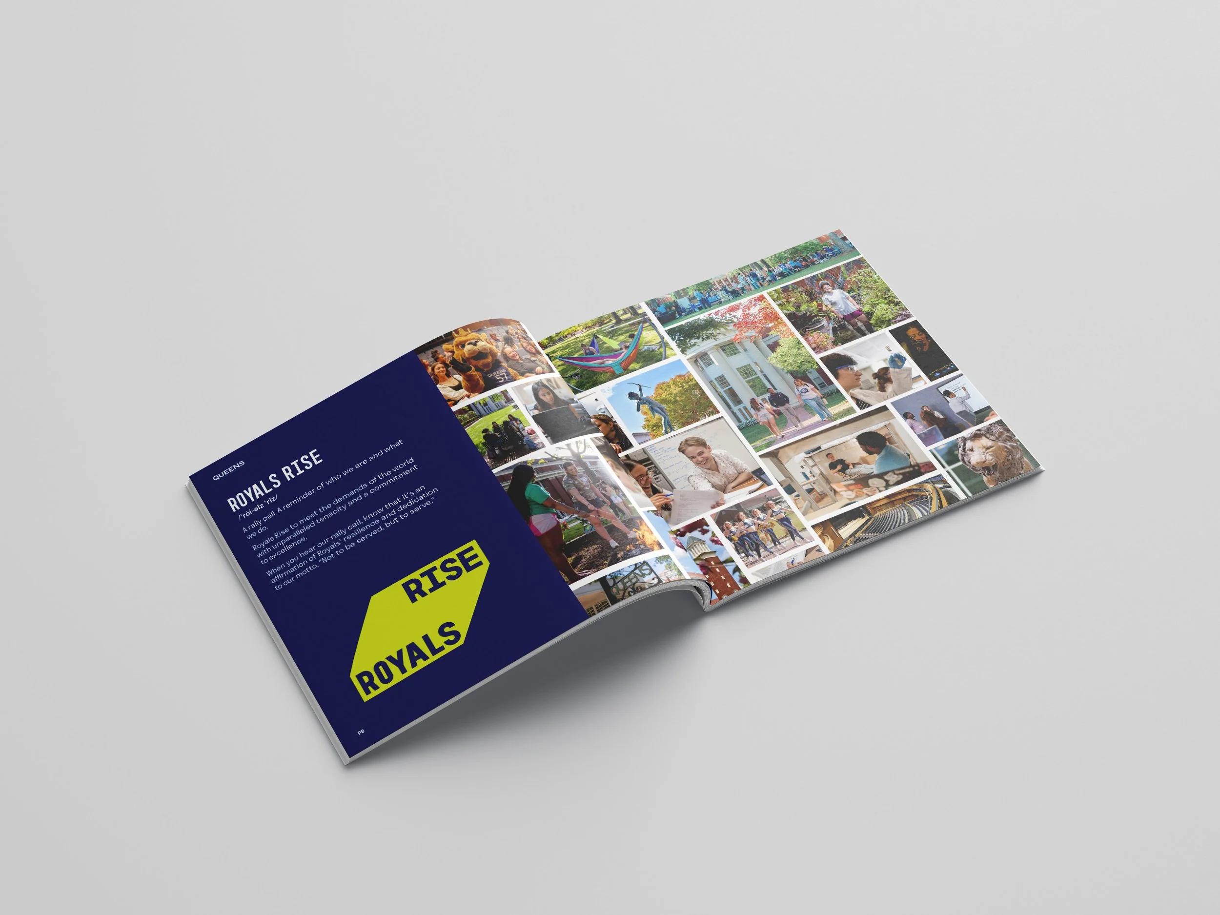
We introduce the university’s “Royals Rise” rally cry and signature prism shape. Leading with this design element helps to connect future brand touch points to the university brand.
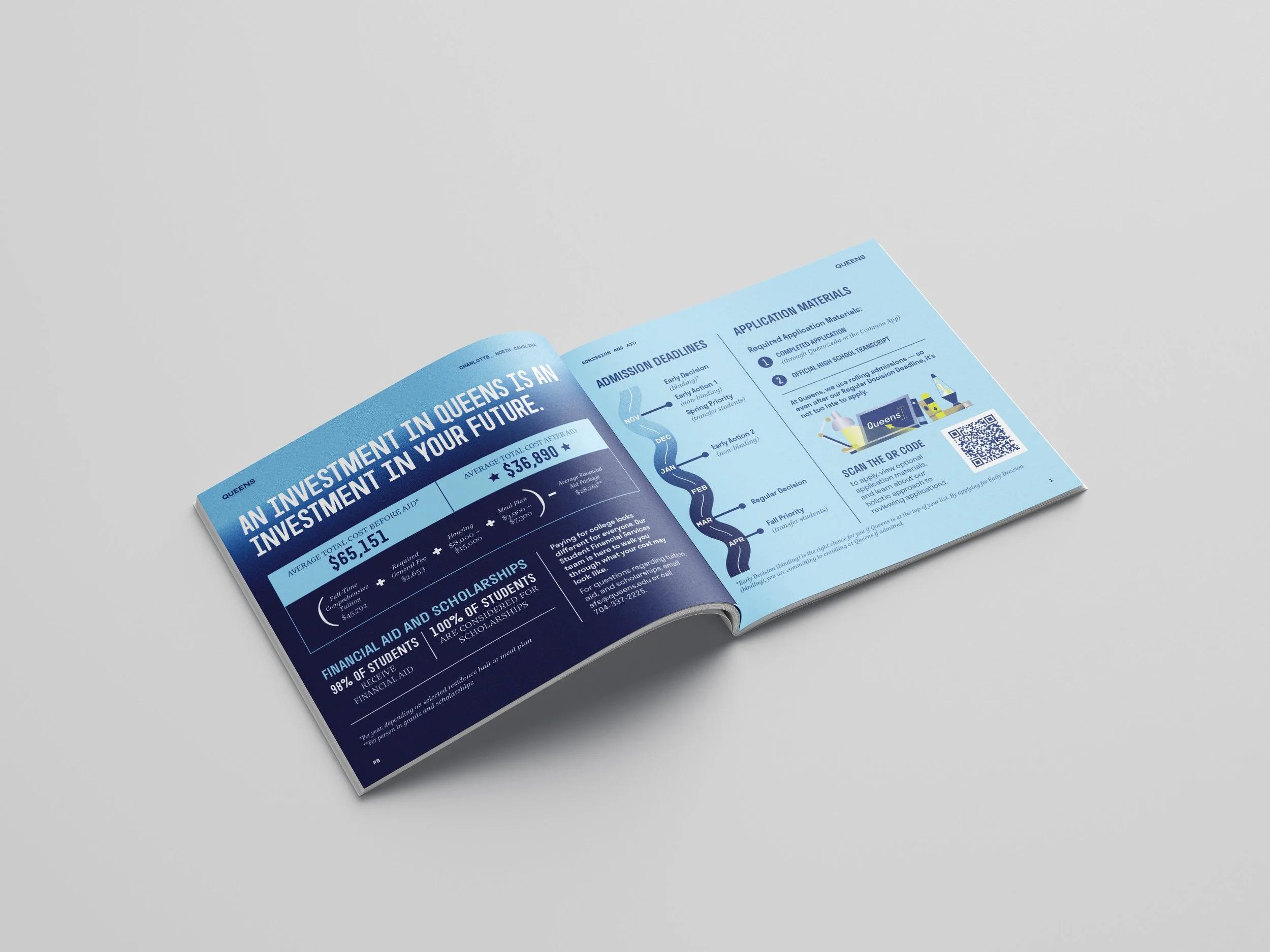
The viewbook highlights a full range of the Queens experience, from academics to residence life, while also providing key information about financial aid, the admissions process, and campus visits. It serves to excite prospects about Queens and provide information that reassures, encourages, and empowers prospects and their parents to apply.
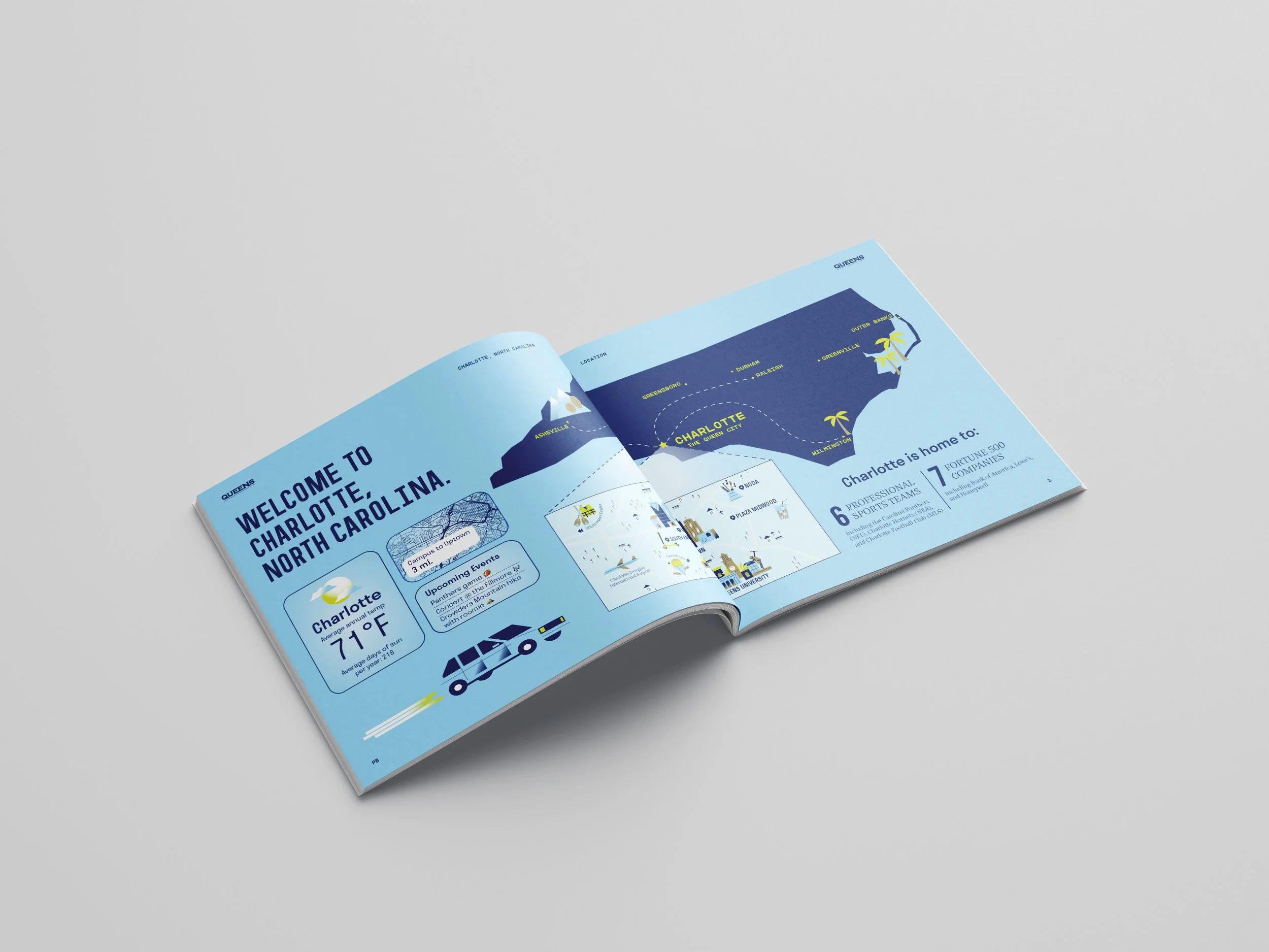
The viewbook was intentionally designed with quick blurbs, fast facts, and infographics rather than large chunks of text. The goal was to provide a broad overview of the Queens experience without overwhelming prospects with heavy text that felt unapproachable to read.
The viewbook is also available digitally for prospective students, with a design adapted to link to the Queens website to dive deeper into areas where they may want to learn more information.
Fast facts sheet
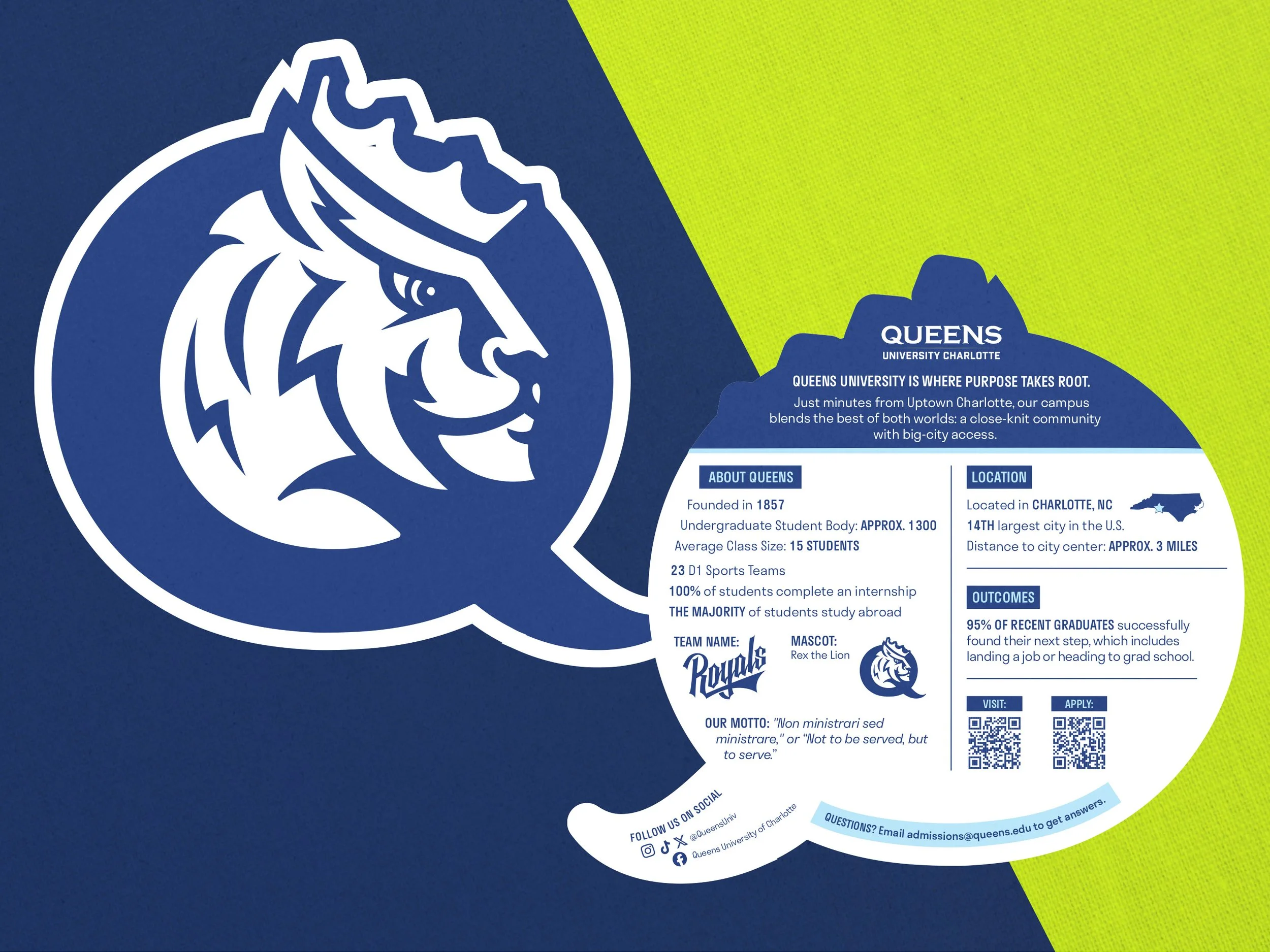
A fast facts sheet was also created to give quick, digestible information that prospects could reference more easily than going through a multi-page viewbook. This piece is in the shape of the Rex head brand mark, a representation of Rex the Lion, Queens University’s beloved mascot. This piece introduces a key aspect of the Queens brand often used to evoke a sense of school spirit and Royals pride.
Table Display
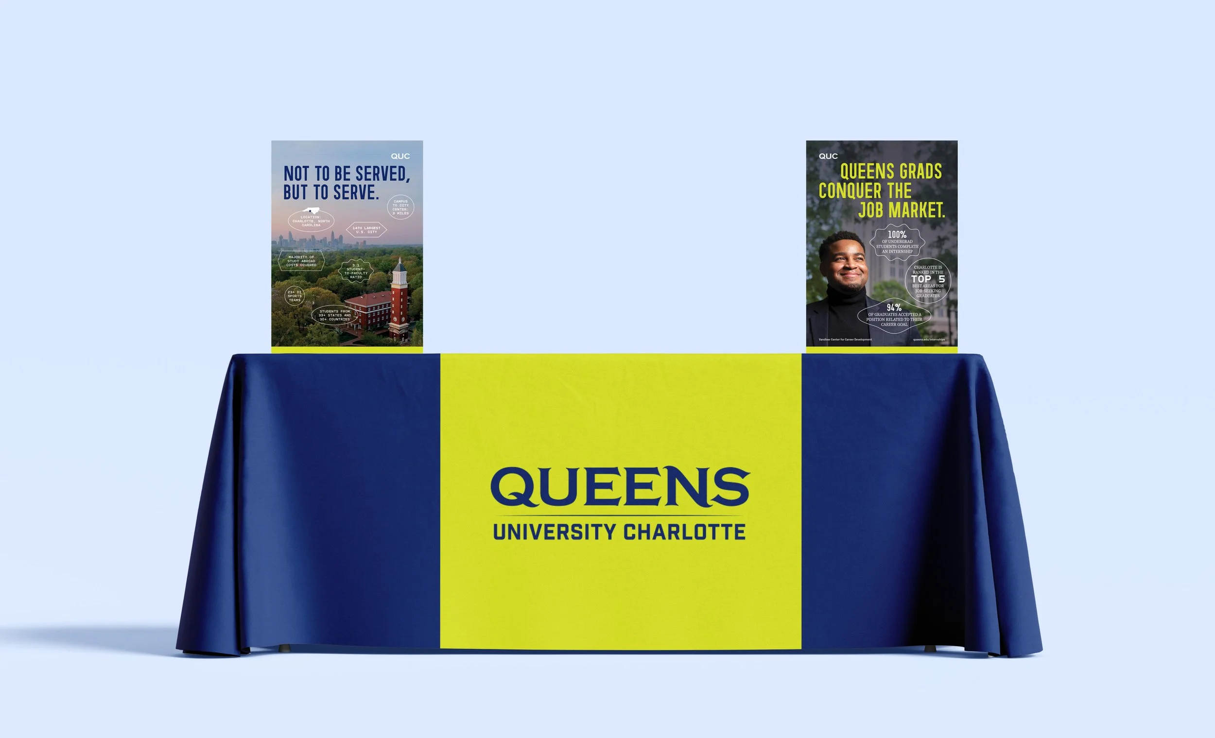
The table display itself pulls in Queens’ boldest brand color: neon yellow. A color not often used in the higher education industry, this made Queens visually stand out from competitors, resulting in more table visits than when a navy blue tablecloth was used.
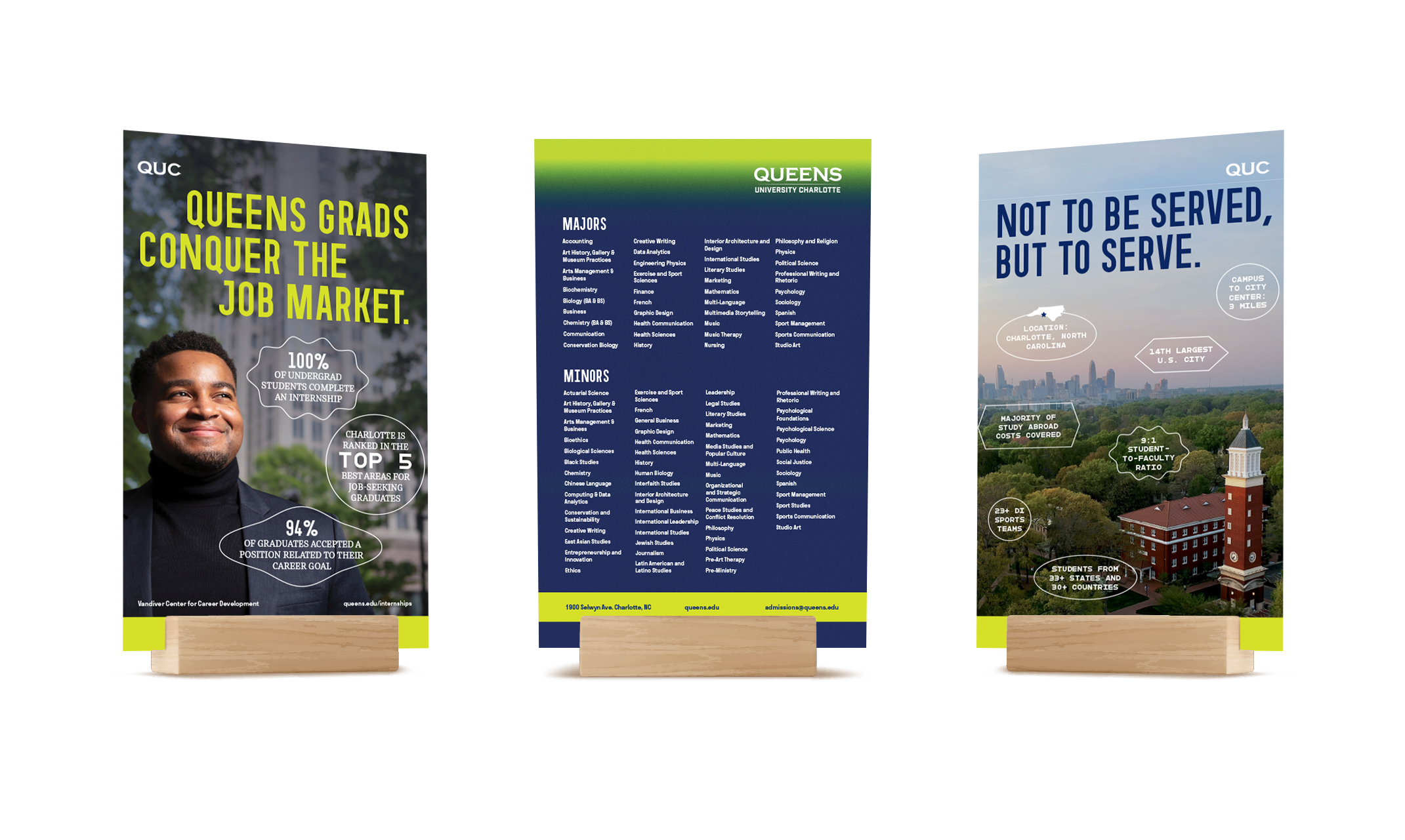
Three tabletop banners were also created to highlight Queens’ primary value propositions and differentiators from competitors. They highlight Queens’ proximity to the major city of Charlotte and the opportunities for students that that proximity allows. One banner also highlights the majors and minors at the university, providing immediate answers to the most common question that admissions counselors receive: “do you offer my intended major?”