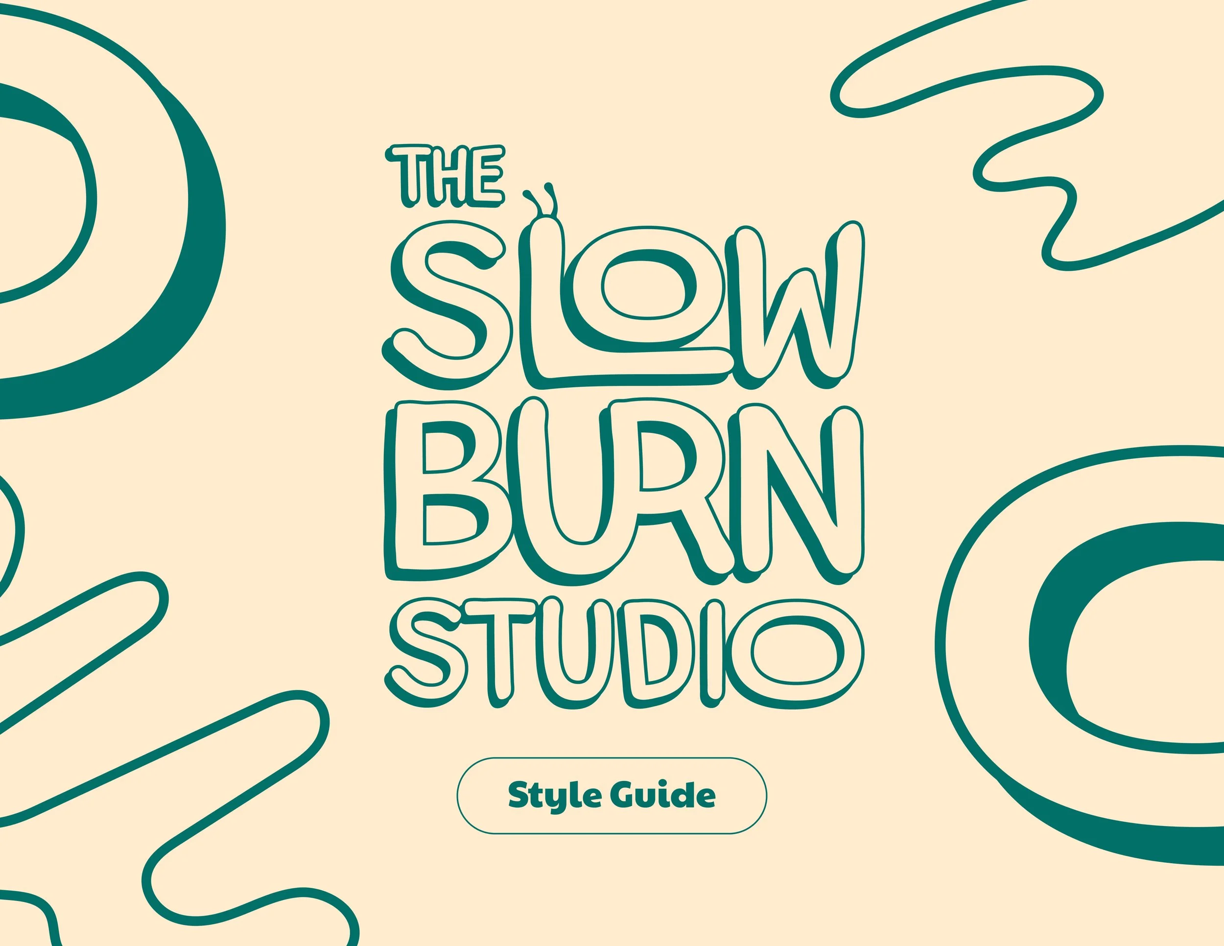
The slow burn studio visual identity
Client
Tyler Myers, The Slow Burn Studio
Year
2024
Tyler Myers had been making ceramics for years and was ready to take his hobby to the next level — by converting his backyard shed into a fully functioning studio where he could teach pottery lessons and sell his work. He had a dream and a name: The Slow Burn Studio. What he needed was a visual identity.
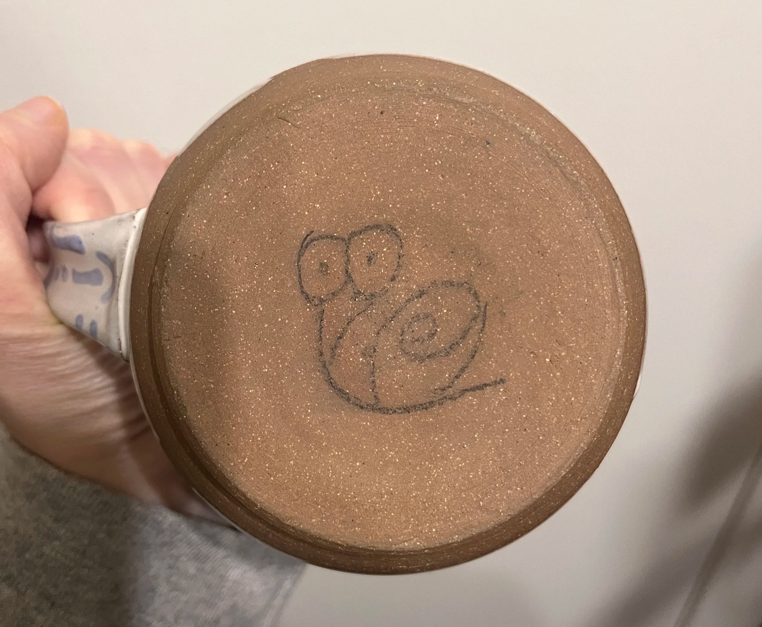
Tyler always marked the bottom of his work with a hand-drawn snail, inspiring the name for his business. While the fiery aspect of ceramics is bold and exciting, it takes patience and care to hand-sculpt the work. The snail serves as a reminder to slow down, enjoy the process, and not get caught up in the idea of perfection.
Through client calls and brand identity work, we found guiding words to help shape the right tone of the work: organic, imperfect, expressive, and fun.
The Logo
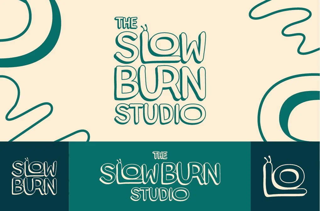
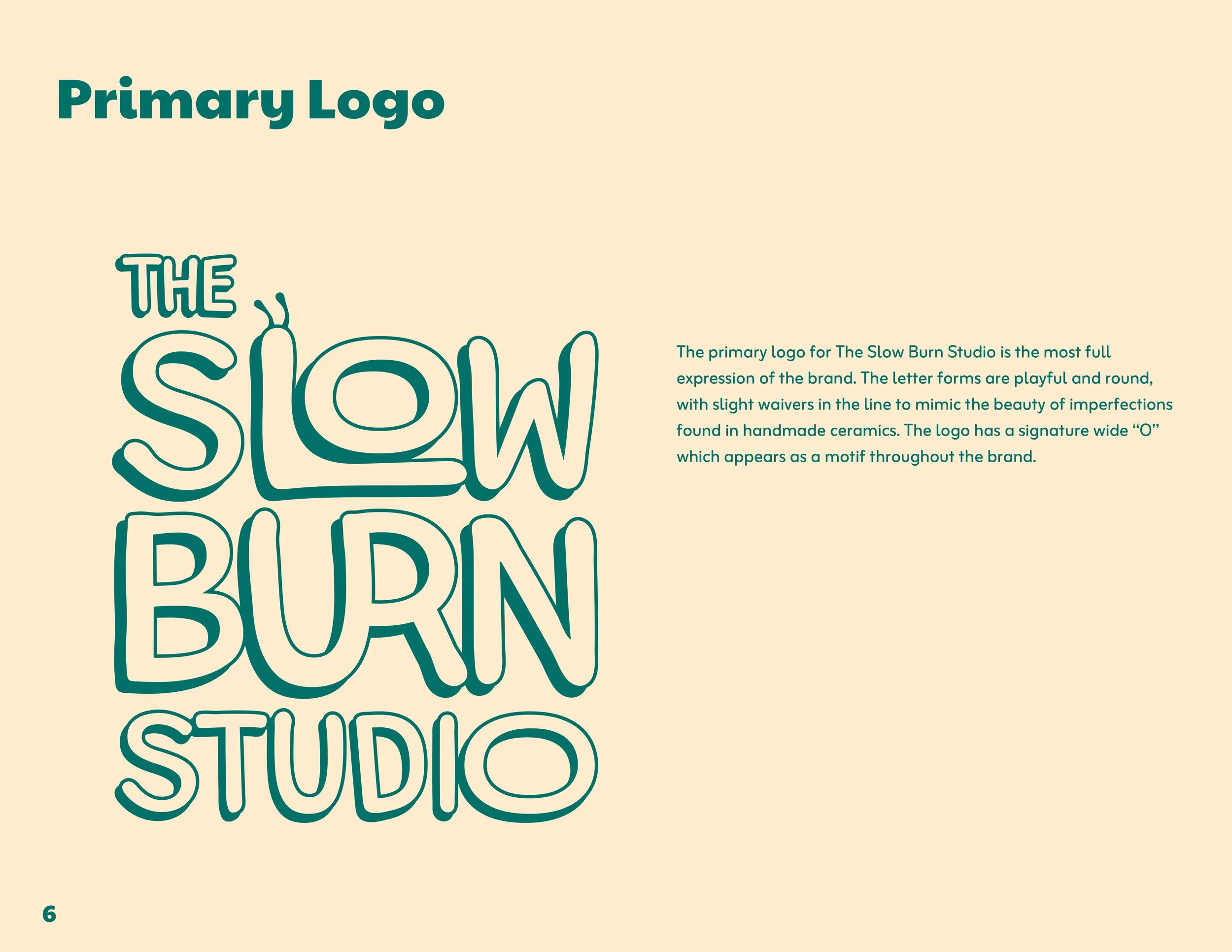
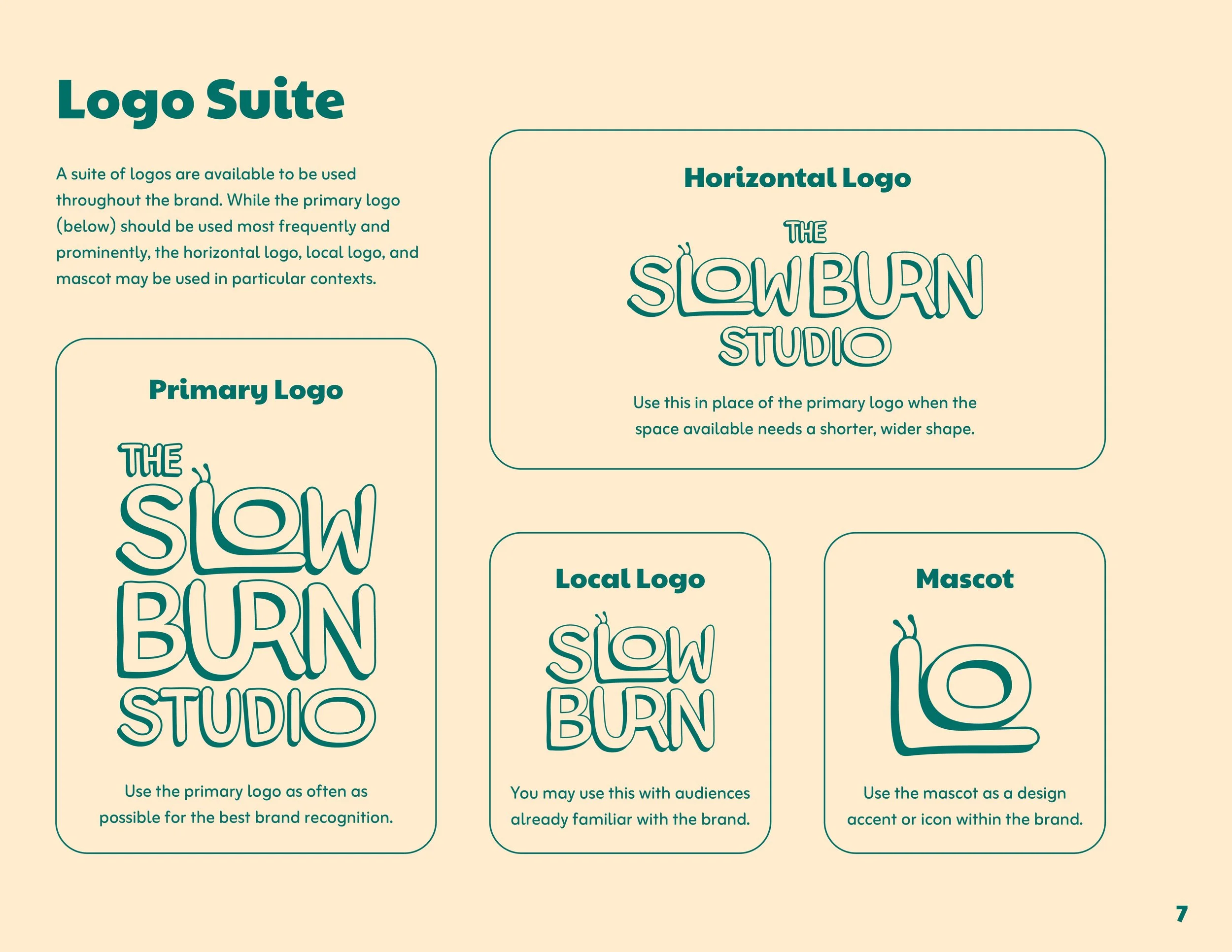
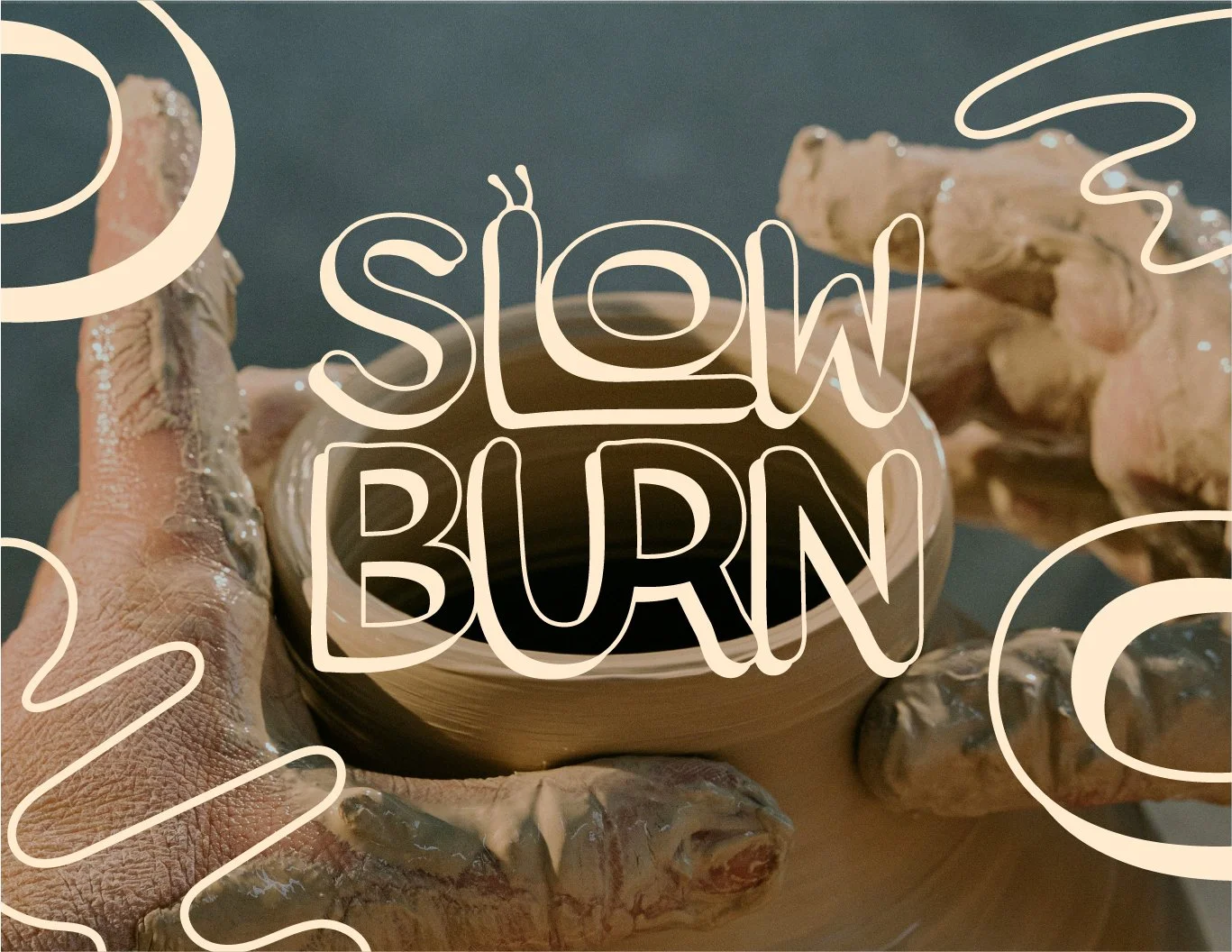
After sketches, concept pitches, and ideation, one logo concept stood out from them all. In addition to the primary logo, a local logo, horizontal layout, and brand icon were created.
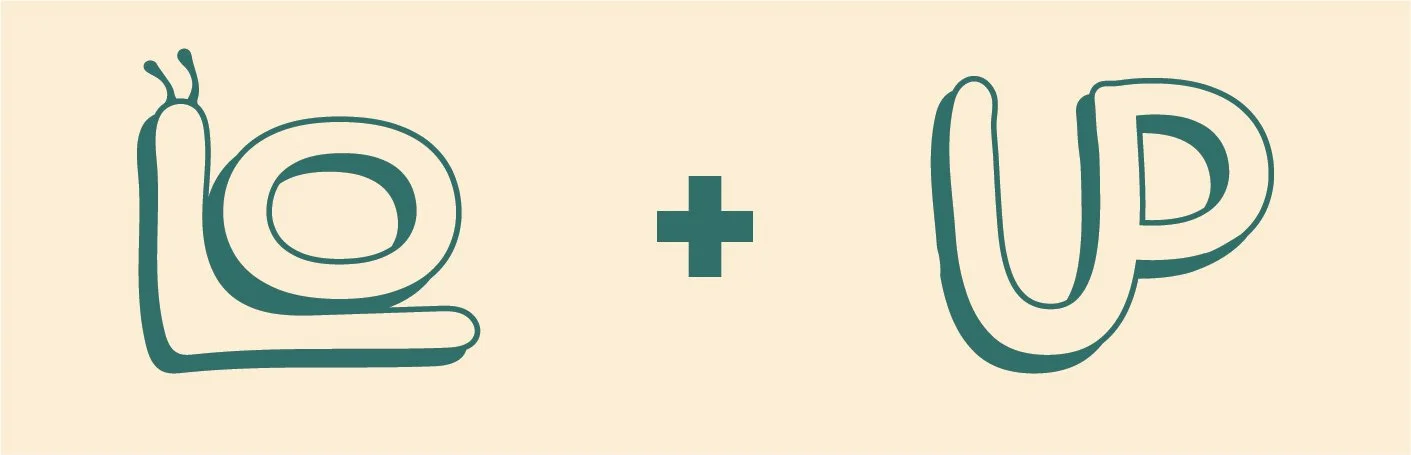
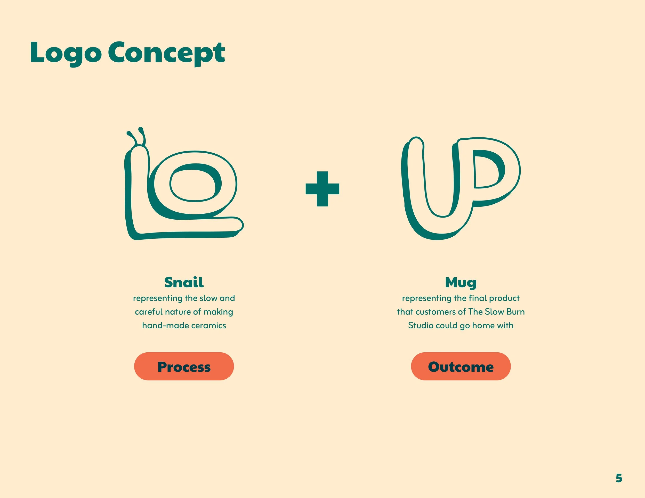
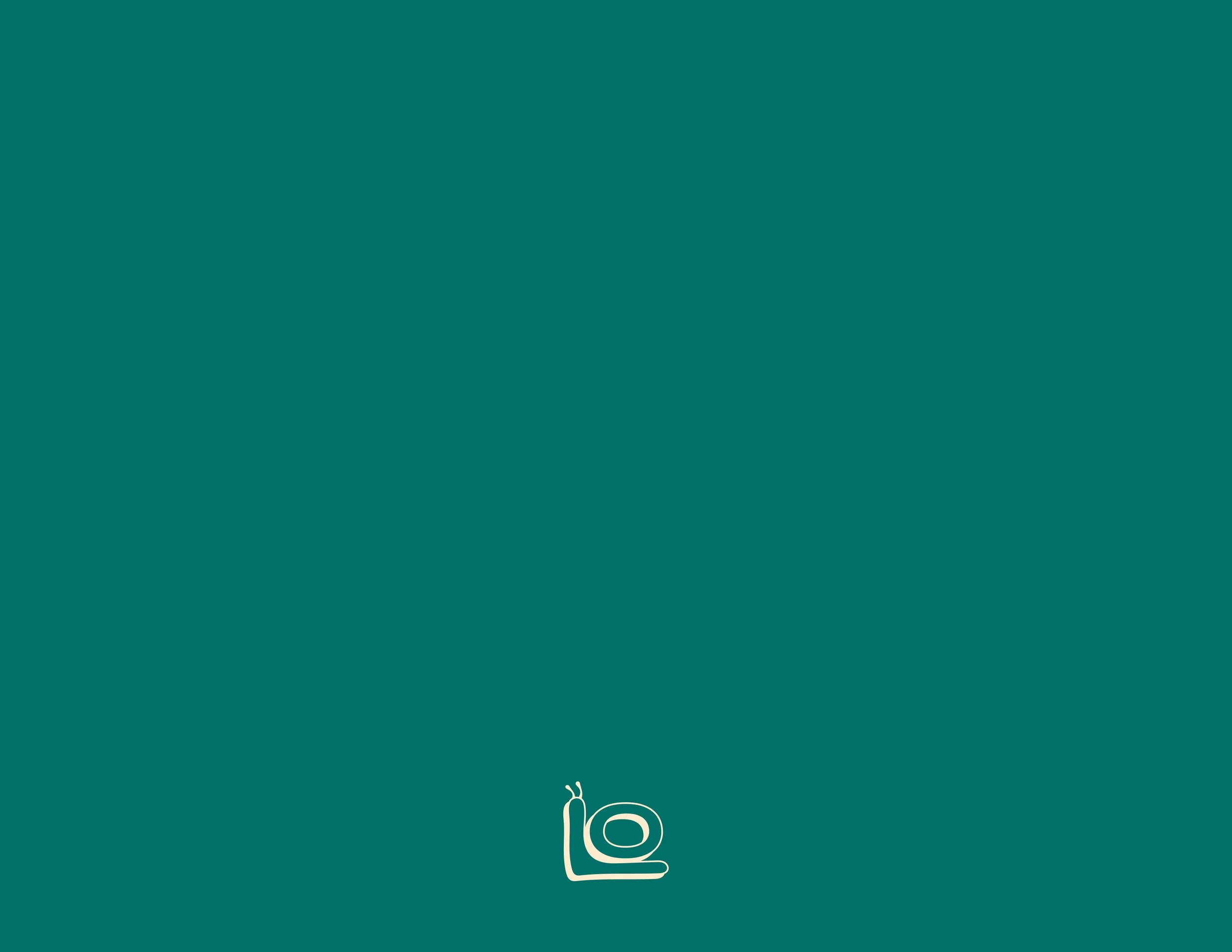
The “L” and “O” in “Slow” come together to form a snail, acting as a reminder of the slow and careful process of making hand-made ceramics.
The “U” and “R” in “Burn” come together to form a mug and its handle, representing the final product that customers of The Slow Burn Studio go home with.
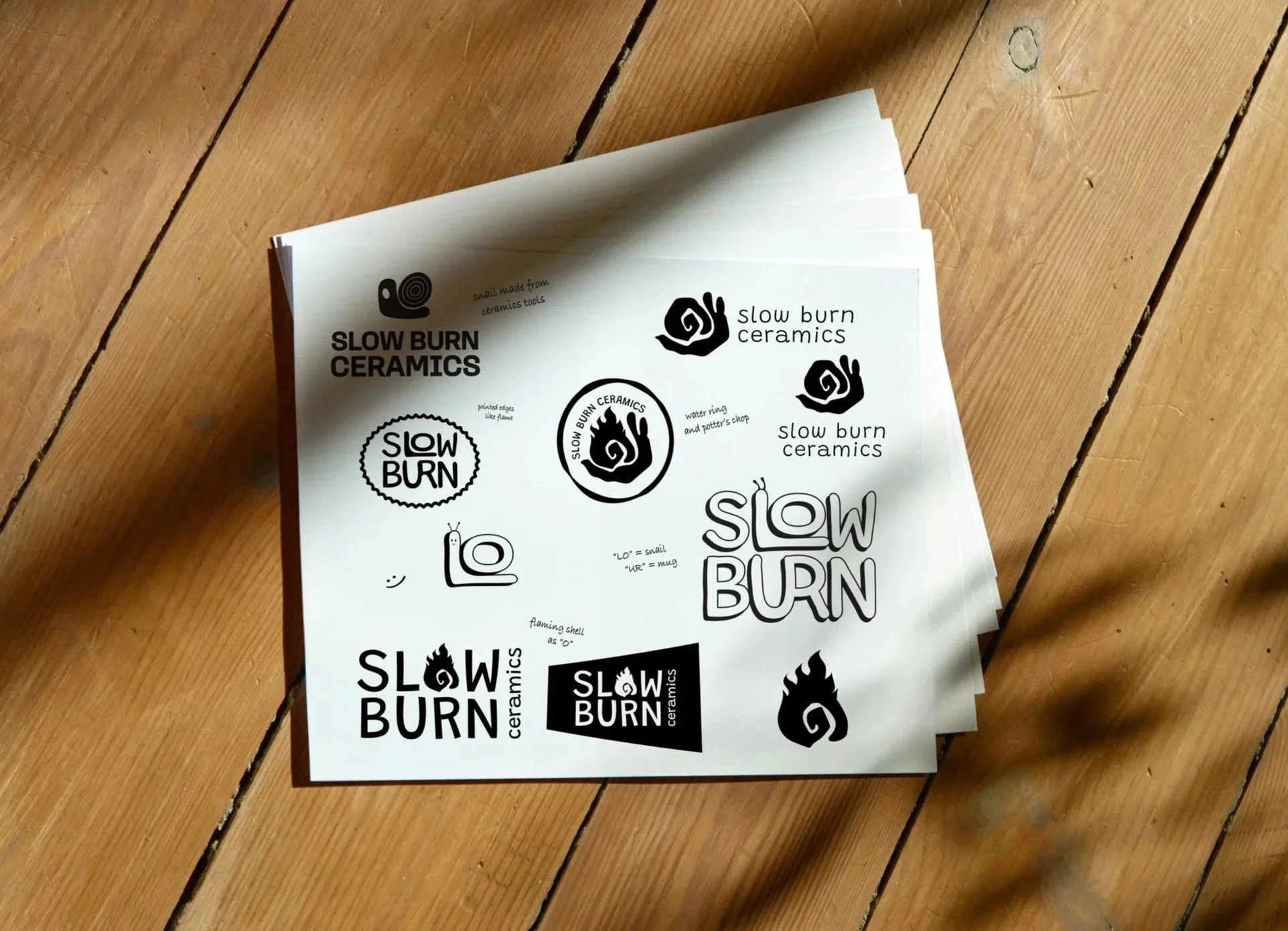
We tried a variety of logo concepts before settling on the final version.
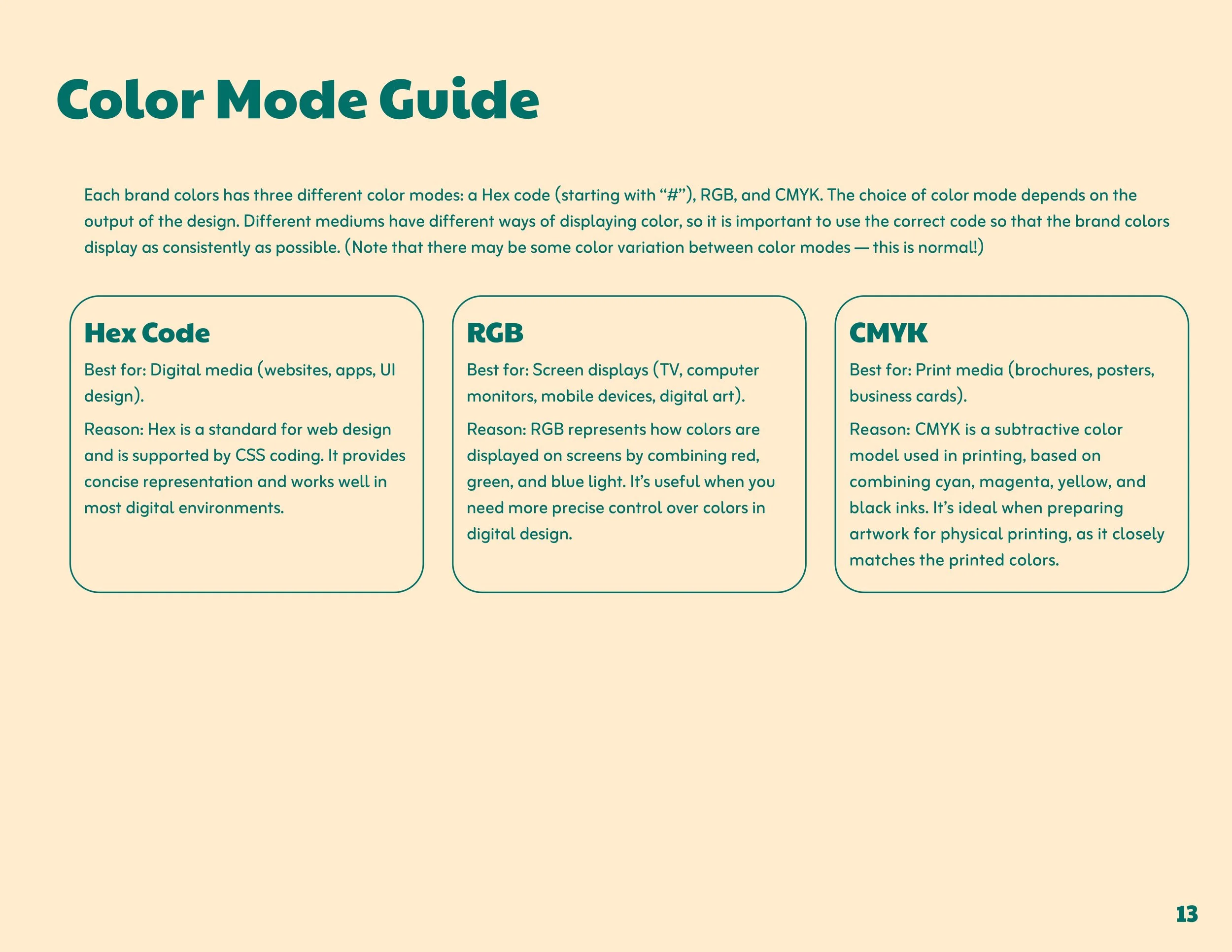
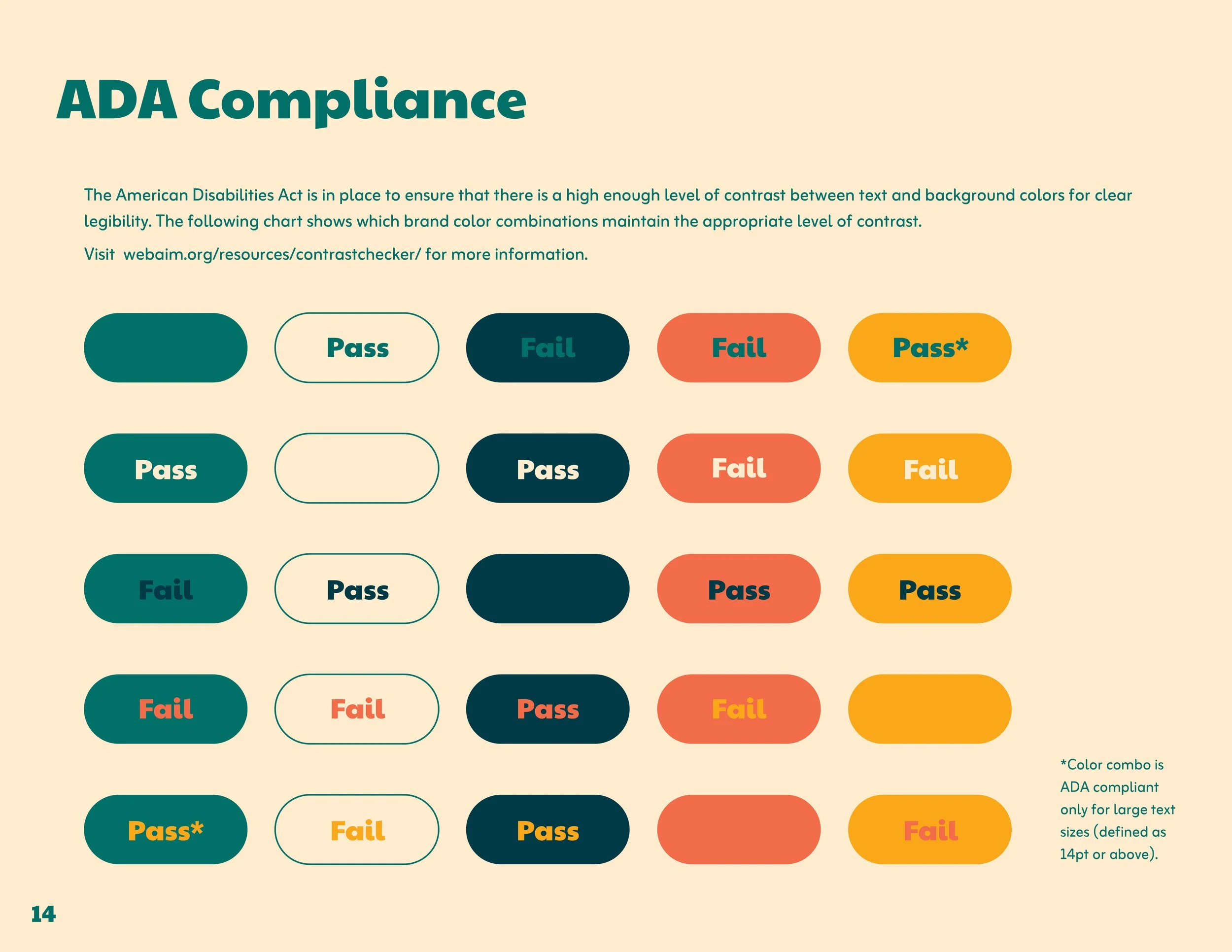
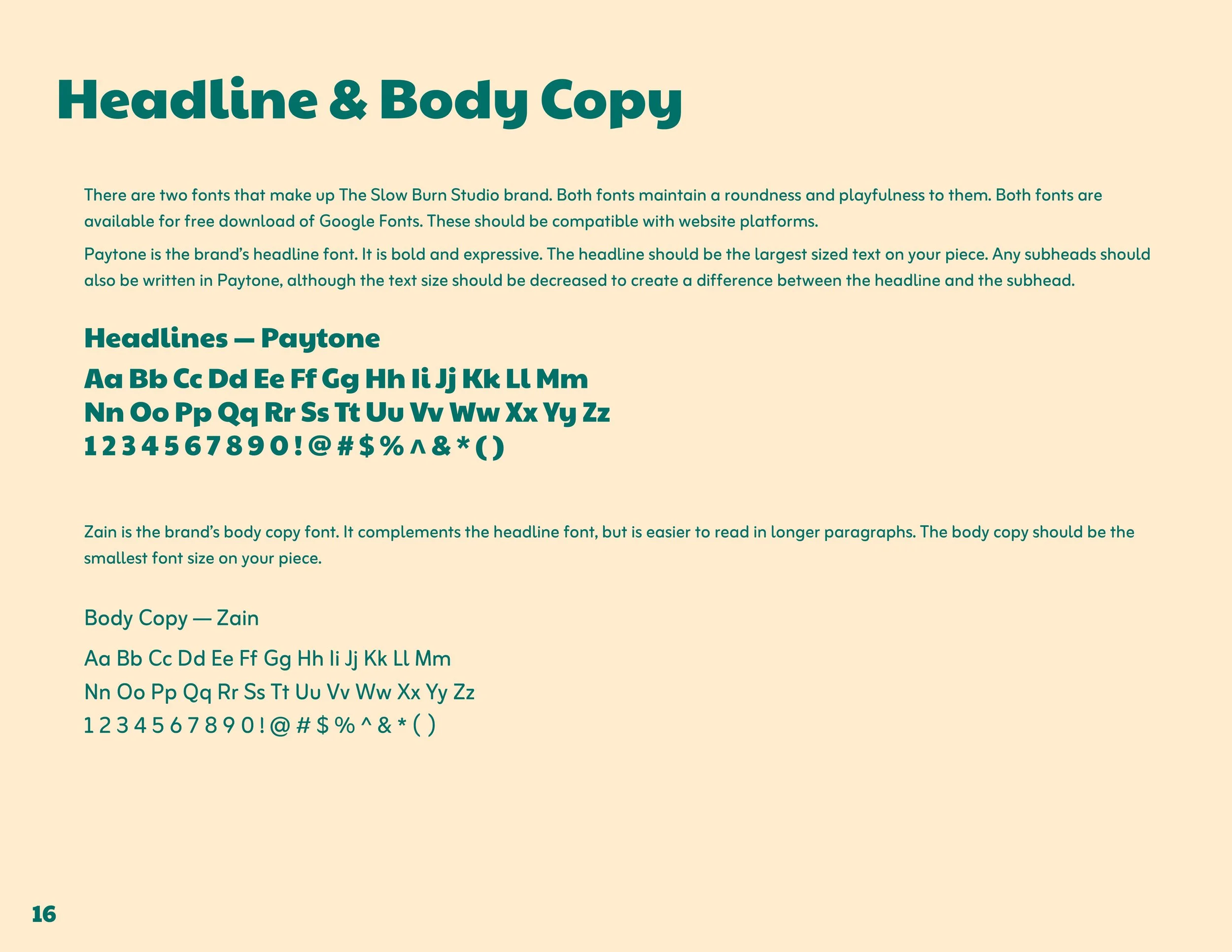
Visual Identity
-
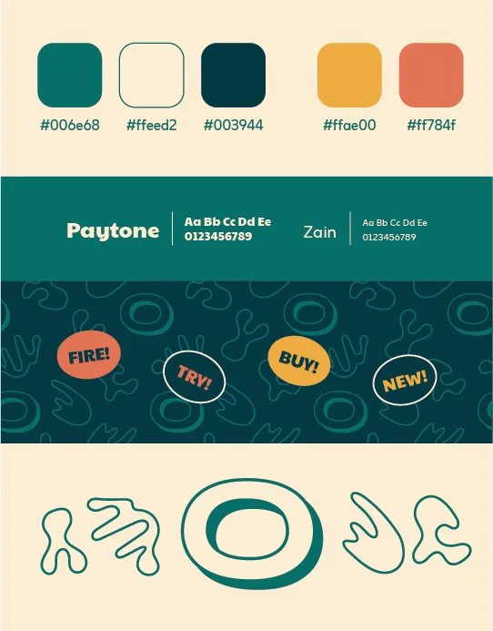
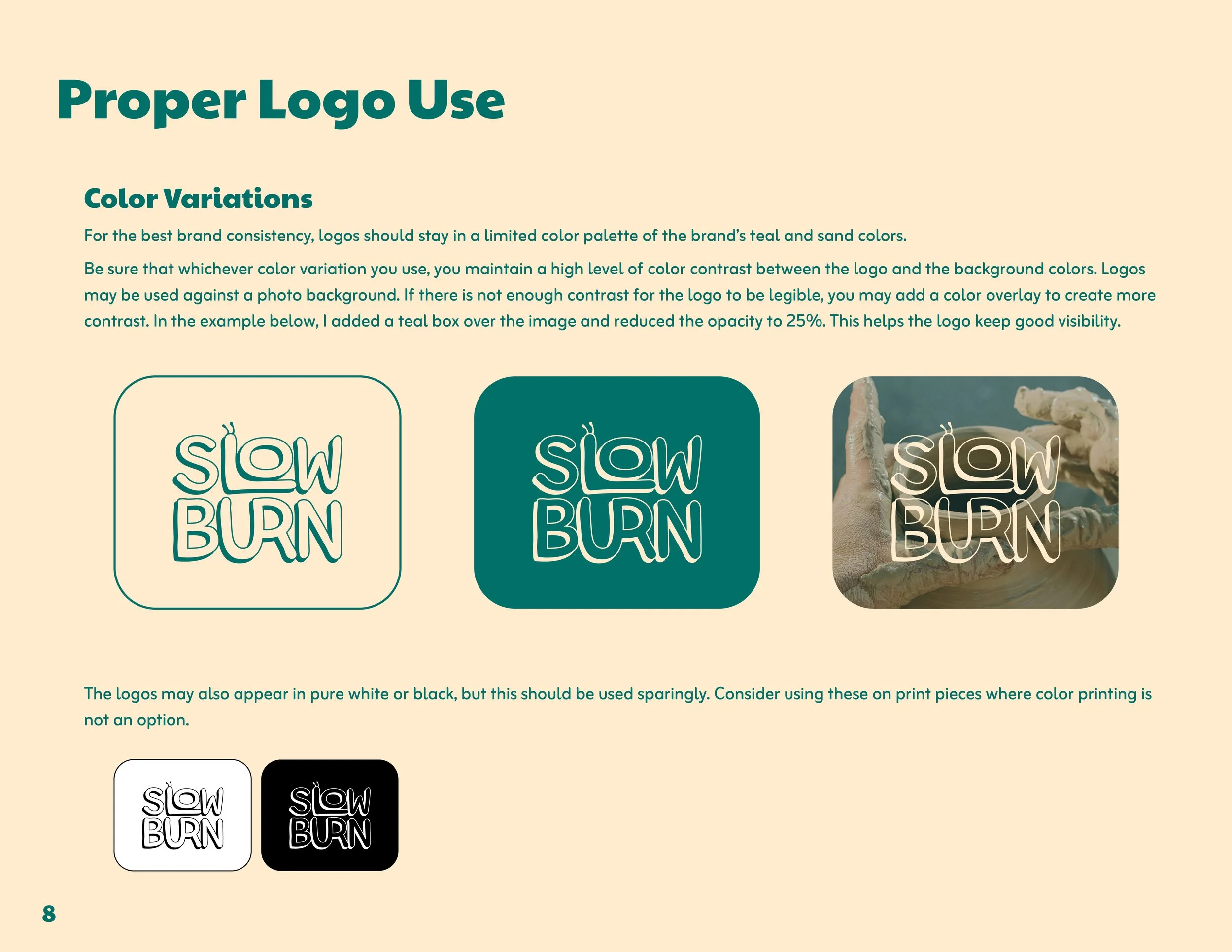
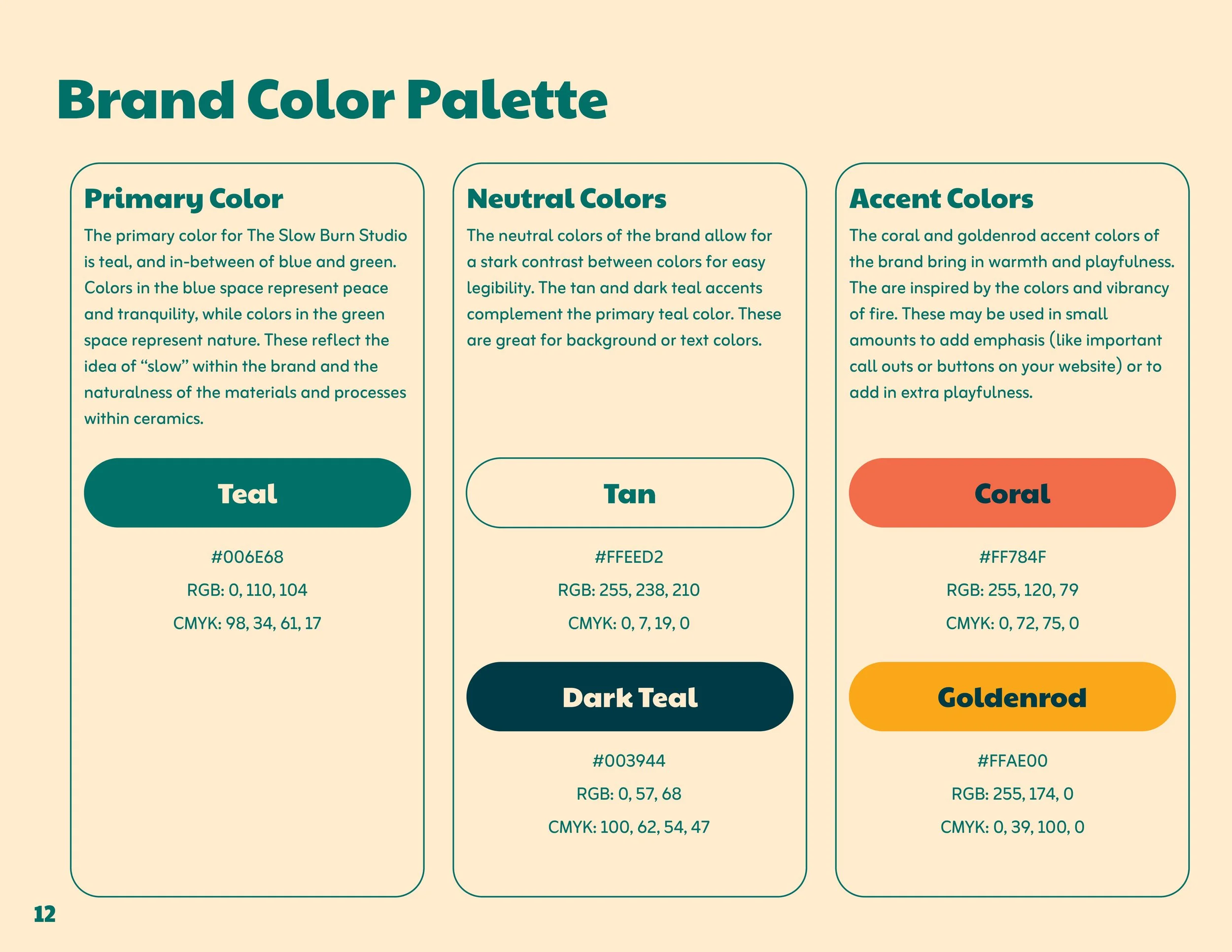
The primary color of teal and complementing neutral tones complement the idea of slowness. The promote peace, ease, and calm. The teal color still maintains a brighter tone, keeping the mood uplifting and happy.
The secondary colors of goldenrod and coral contrast with the primary palette to bring in warmer tones that mimic fire. They are bold, punchy, and intended to generate excitement and highlight calls to action.
-
Paytone is a fun, expressive font intended to be used for headlines and subheadings.
Zain should be used for body copy — it has a roundness to keep it playful and in line with the organic lines throughout the brand, but maintains clear legibility for ease of reading longer paragraphs.
-
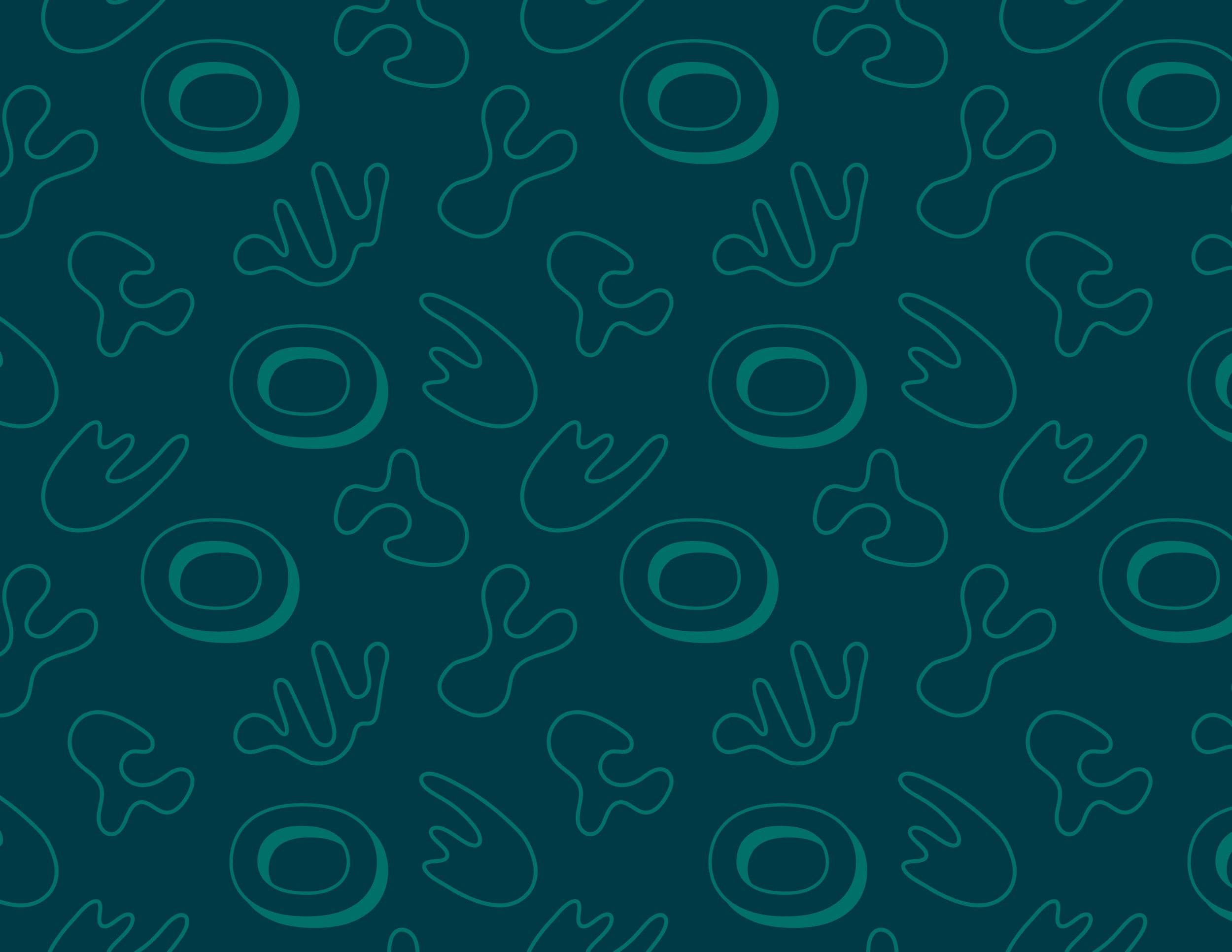
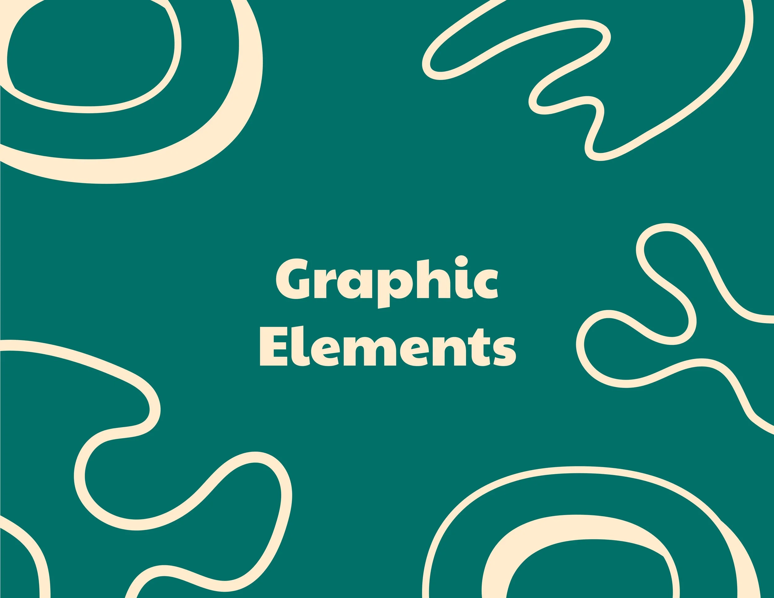
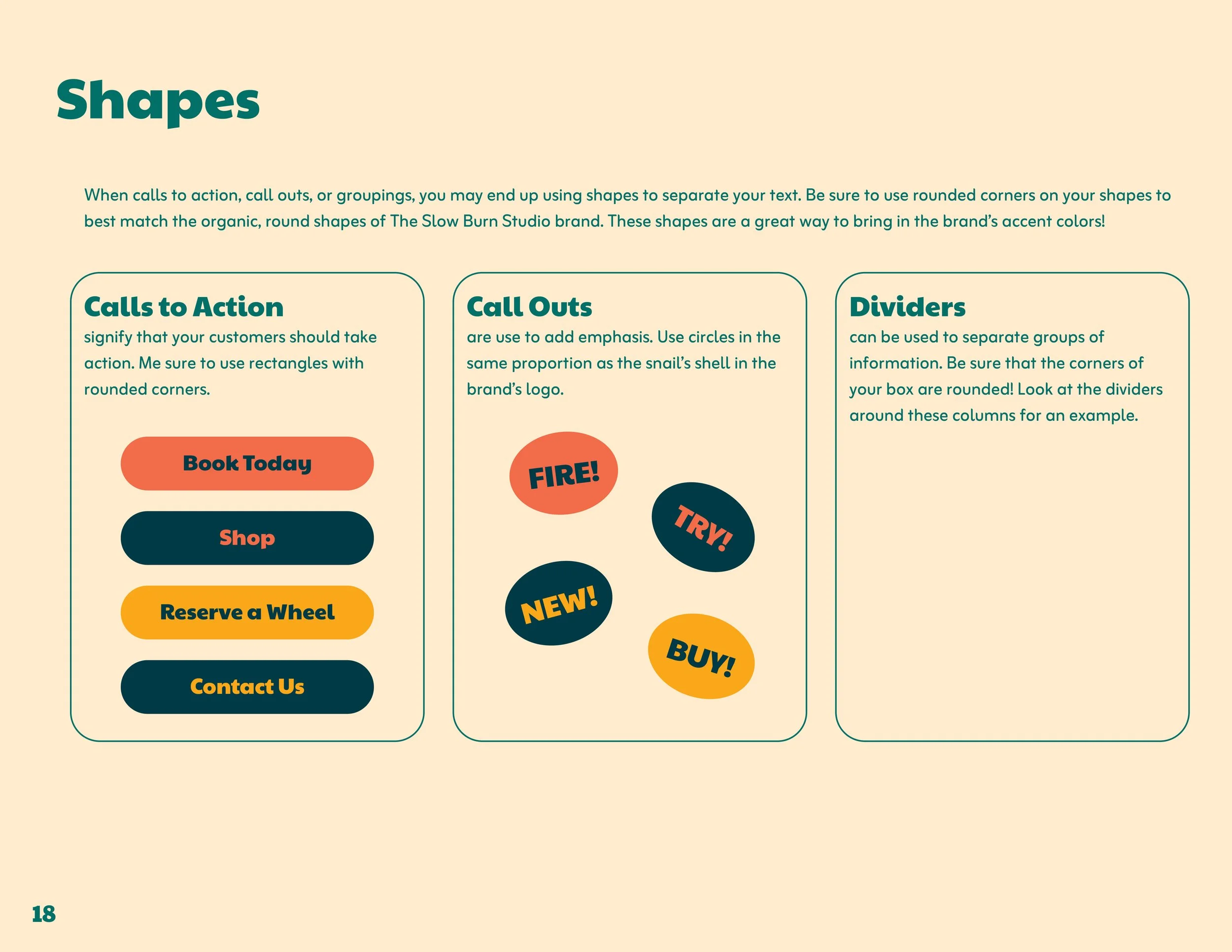
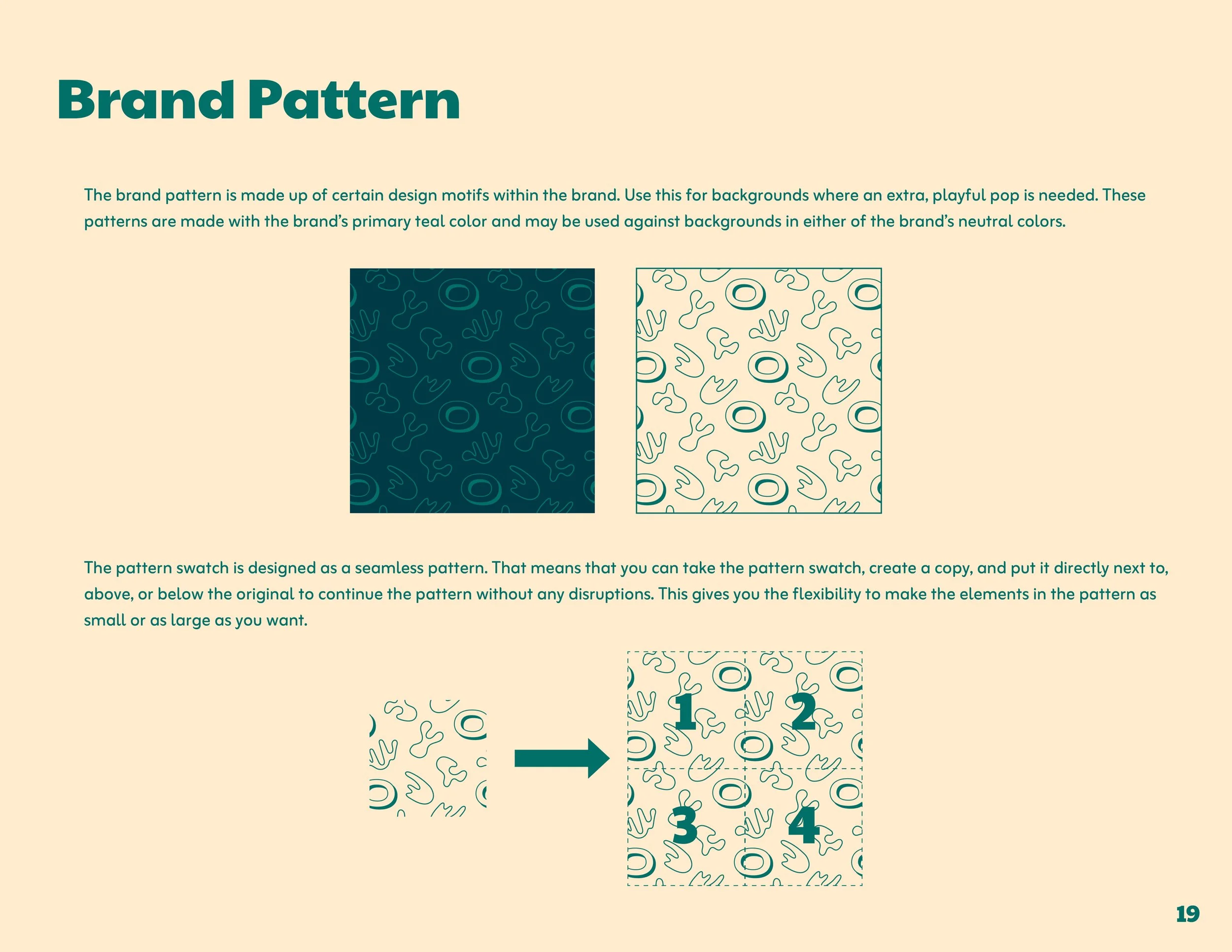
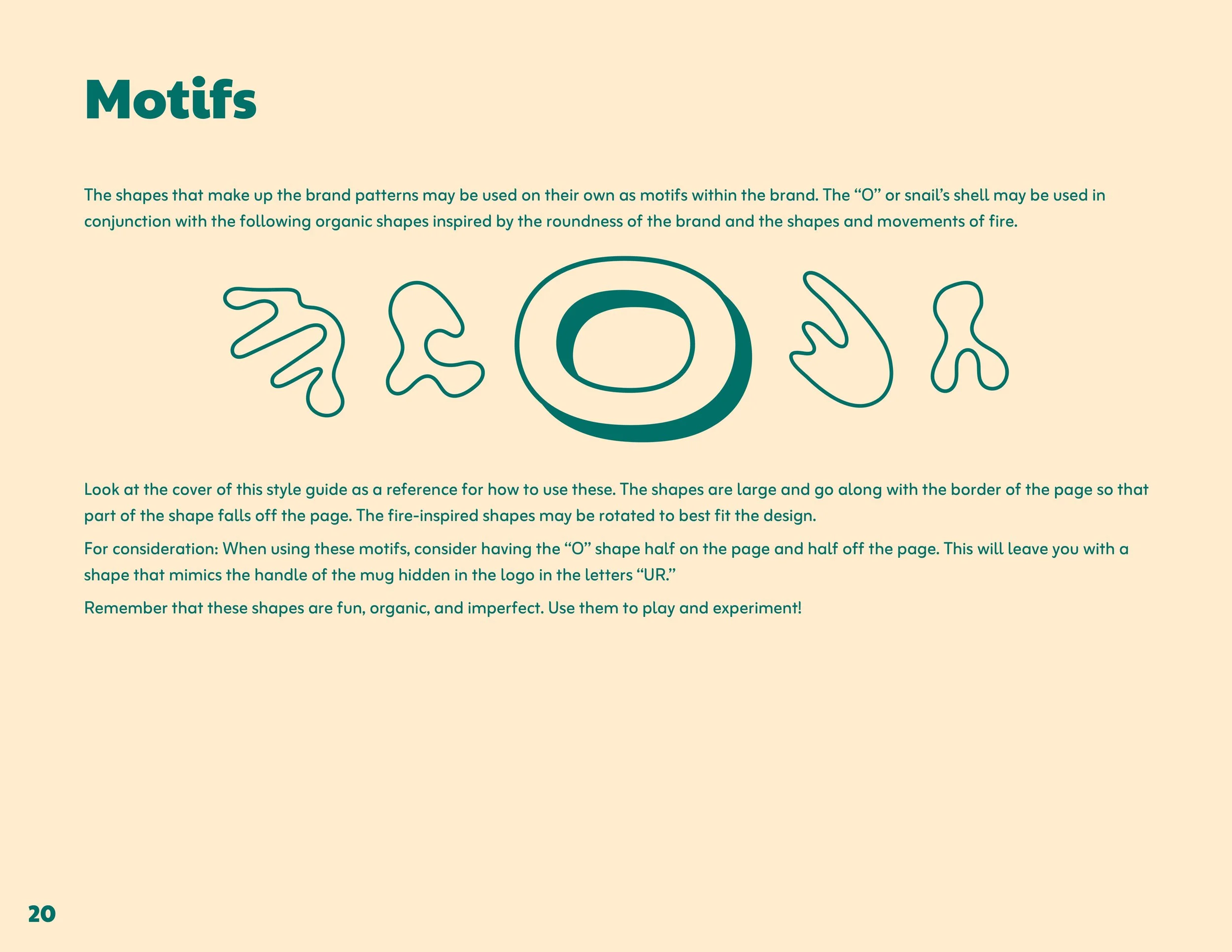
The graphic elements and design motifs used in the visual identity use rounded corners and abstract, organic shapes. These shapes refer to the fluidity of the creative process and the idea of concepts morphing and expanding over time.
The “O” shape from the logo is used to help create greater continuity in the brand.
The secondary color palette can come into play here for call outs or calls to action. When possible, the shape of these call outs should stay within proportion to the “O” shape from the logo.